Minimum logo height:
24 px on screens
8 mm in print
The circular symbol is the graphic part of the logotype. As a standalone element it is used only in exceptional cases – typically in the product and packaging design of KELLYS products, as a favicon or as a graphic element in a print.
The idea behind the symbol
The basic shape of the KELLYS logotype symbol is a circle as the symbol of a wheel, expressing movement and dynamism. The inner part of the circle is filled by the typographic abbreviation of the initial letter “K” of the brand name.
Warning
The symbol is an integral part of the logotype. Using it on its own is acceptable only in exceptional cases – for example in the product and packaging design of KELLYS products.
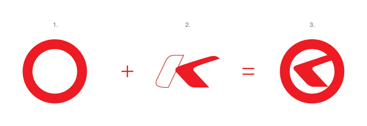
- 1. CIRCLE – wheel, movement, dynamism
- 2. “K” – a fragment of the letter “K” as a road with a bend
- 3. SYMBOL – moving towards new experiences
Protection zone
33 % of the logo's height
It is the space around the logo where no surrounding graphic elements (other logos, texts, images, page margins, etc.) should interfere, to prevent the brand from being compromised. The logo is most often found in the context of other elements, from which it distances and differentiates itself thanks to the protective zone space.
Protection zone
Things to avoid
The manual does not permit the logotype or its individual parts to be modified, distorted or reshaped in conflict with the corporate rules. Taking parts of the logo out and using them separately without prior consultation with the authors of the logotype is equally unacceptable. Swapping the colours of the individual parts of the logo or the typeface of the supplementary lettering is not permitted either.
Do not use shadows
Do not rotate the logo
Do not recolor the logo
Do not deform or change the original proportions of the logo