Minimum logo height:
48 px on screens
17 mm in print
The KELLYS logo is the core element of the visual style of KELLYS BICYCLES. It consists of a graphic part – the circular symbol – and a typographic part, the KELLYS name, to which the BIKE COMPANY line is attached as a definition of the company’s field of business. The centred version has the symbol placed above the name.
Rules for using the logo
Five rules that cover most everyday situations. They apply to all versions of the KELLYS logotype.
Tip
Every user of the KELLYS logotype is obliged to follow the rules of this manual in business correspondence, in internal and external company communication, in marketing and in advertising materials. Questions about non-standard use: marketing@kellysbike.com.
- The symbol and the typographic part form a whole. Using the typographic part separately from the symbol, or the other way round, is not permitted in communication.
- The symbol on its own only as an exception – for example when creating the product and packaging design of the KELLYS product portfolio. Any use of the symbol other than the prescribed one requires an experienced graphic designer.
- On a coloured background, texture, photograph or illustration the negative version is the first choice.
- The logo is never redrawn. The construction grid serves for orientation only; the exception is cases where electronic files cannot be used (for example hand-painting the logo on a wall).
- The clear space is a minimum. We recommend using a larger area than the manual prescribes.
Logo construction
The geometry of the logo is built on the mutual proportions of the circles of the symbol. The construction grid shows the proportions, the relative positions and the sizes of the individual elements of the logo and serves for orientation only.
Warning
Always use the original files from the logopack. A redrawn logo is not the KELLYS logo.
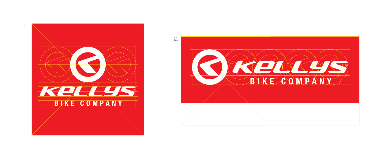
- Square version (centred): the width of the KELLYS name equals a total of 3 full circles of the symbol overlapping by the stroke width.
- Rectangular version (horizontal): the KELLYS name is built from five overlapping circles of the symbol.
- The logo must not be redrawn or reconstructed from the grid. The exception is cases where electronic files cannot be used – for example hand-painting the logo on a wall.
Clear space
The clear space is the area that no foreign objects may enter – no graphic elements, no photographs and no text. Its distance from the edge of the logo is defined proportionally by the circle of the symbol and the height of the letter “e”. This is a minimum; we recommend using a larger area than the manual prescribes.
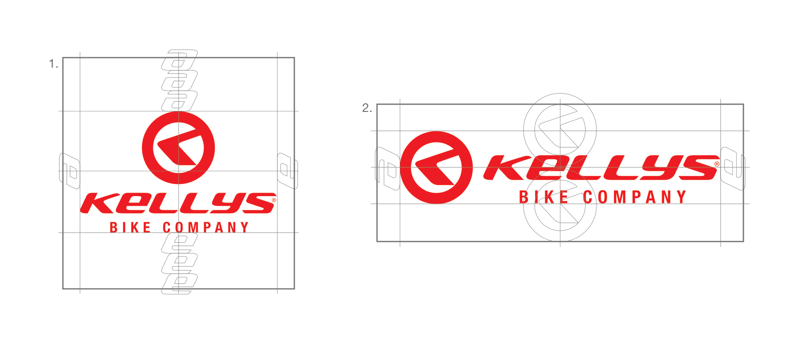
- 1. centred version – the clear space is derived from the circle of the symbol and the height of the letter “e”.
- 2. horizontal version – the same principle, the area follows the rectangular shape of the logo.
- Keeping to the limits of the clear space keeps the brand distinct and legible.
Black and white version
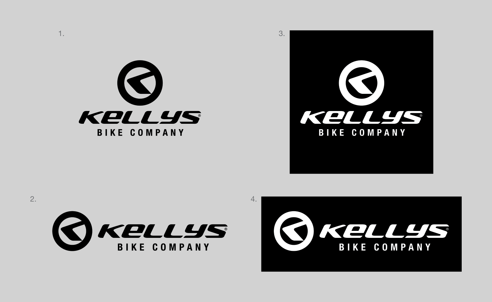
For single-colour printing, stamps, engravings and faxes the black and white version of the logo is used.
• Positive (1, 2) – black logo on a light background
• Negative (3, 4) – white logo on a black background
The black corresponds to the corporate black K100.



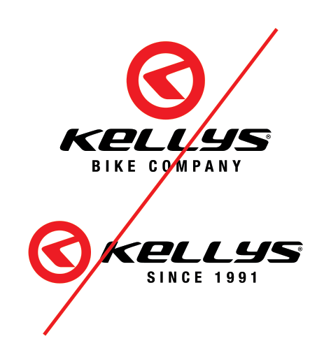
Swapped colours of the symbol and the typographic part
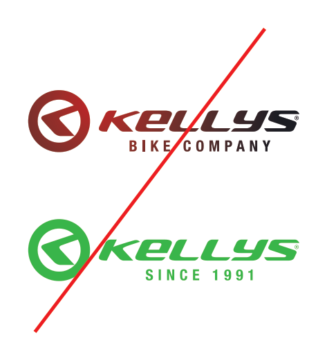
Colours other than the prescribed corporate ones
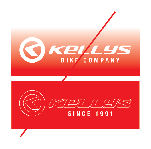
Gradients and insufficient contrast of the background
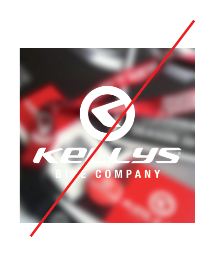
Logo on an illegible photograph, interference with the shape of the lettering
Prohibited use – shape distortions
The manual does not permit the logotype or its individual parts to be modified, distorted or reshaped in any way. Taking parts of the logo out and using them separately without prior consultation with the authors of the logotype is equally unacceptable. Swapping the typeface of the supplementary lettering is not permitted either.
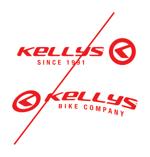
Swapped order of the symbol and the typographic part
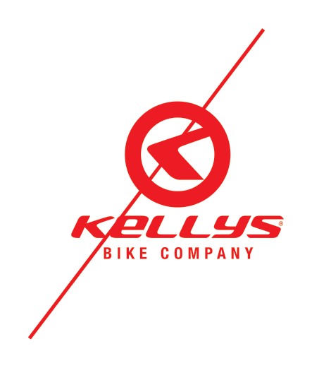
Changed proportions and positions of the elements
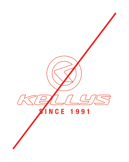
Outline version of the logo
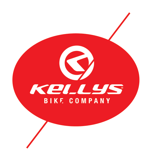
Placing the logo into foreign shapes and distorting it
The examples shown are only an indicative sample – they are not a complete list of prohibited modifications. Cannot find your case? Get in touch at marketing@kellysbike.com.
Downloads
The complete logo manual in PDF and the original vector source files. Download the individual logo versions above, the whole logopack with the ZIP button.
Note
© Kellys Bicycles, 2015 · graphic design paul+munn creative · document KELLYS_LOGOMANUAL_2019_CZ · files also at kellysbike.com.
Protection zone
50 % of the logo's height
It is the space around the logo where no surrounding graphic elements (other logos, texts, images, page margins, etc.) should interfere, to prevent the brand from being compromised. The logo is most often found in the context of other elements, from which it distances and differentiates itself thanks to the protective zone space.
Protection zone
Things to avoid
The manual does not permit the logotype or its individual parts to be modified, distorted or reshaped in conflict with the corporate rules. Taking parts of the logo out and using them separately without prior consultation with the authors of the logotype is equally unacceptable. Swapping the colours of the individual parts of the logo or the typeface of the supplementary lettering is not permitted either.
Do not use shadows
Do not rotate the logo
Do not recolor the logo
Do not deform or change the original proportions of the logo
Logo on a Colored Background
For every use of the logo on a coloured background, texture, photograph or illustration, the negative version is the preferred choice. Where the technology and the type of use do not allow it, a single-colour monochrome version of the logo is permitted.
Background color: #ffffff
Logo version: Logo for light background
Background color: #e6e6e6
Logo version: Logo for light background

Background color: #dc0000
Logo version: Logo for dark background
Background color: #000000
Logo version: Logo for dark background
Background color: #4d4d4d
Logo version: Logo for dark background
Background color: #dc0000
Logo version: Logo for light background
Background color: #f7b3b3
Logo version: Logo for dark background
Background color: #7a1010
Logo version: Logo for light background
Logo on an Image Background
Place the logo in a calm part of the photograph with sufficient contrast. The negative (white) version takes precedence; the red version is acceptable on a photograph only on a light, uncluttered area.
Logo version: Logo for dark background
Logo version: Logo for light background